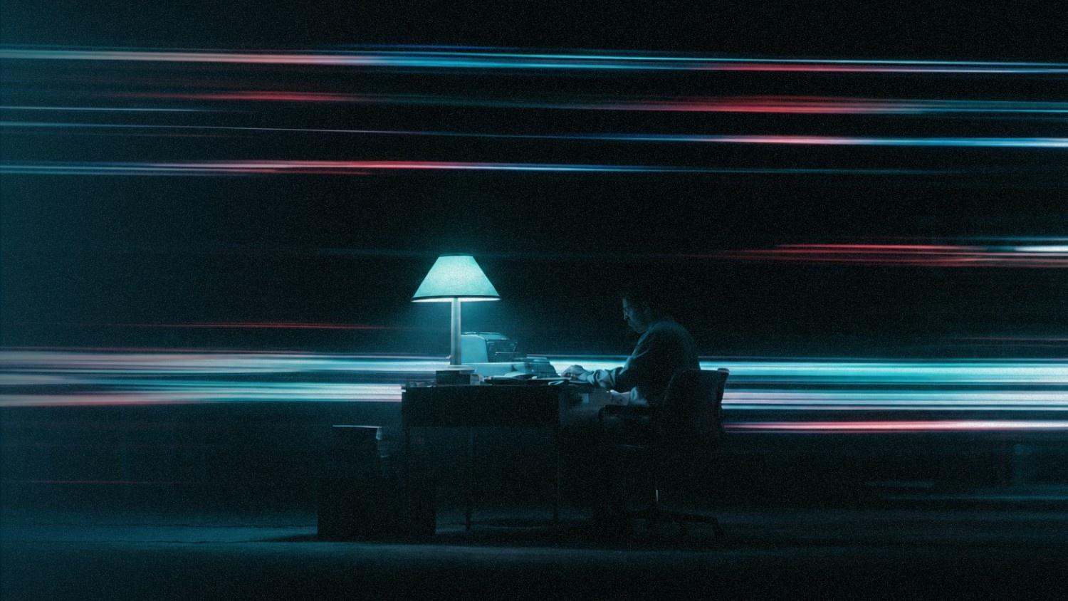
Everything feels softer, warmer, a little more human.
AI raised the ceiling on how polished a brand can look, and creative teams responded by leaning the opposite way. That single shift is reshaping every visual identity trend worth watching this year.
ALSO READ: UI Design 101: 7 Essential Tips Every Designer Should Follow
The Big Shift: Away From Perfect, Toward Human
The branding trends 2026 has crowned share a common thread.
When machines can generate flawless visuals in seconds, flawlessness stops being a signal of effort. Warmth, honesty, and evidence of a human hand become the new currency, and it shows up in three places first.
1. Hand-Crafted Imperfection Is Winning
Brush strokes that show the artist’s hand, letterforms that lean a little off, textures that look scanned rather than rendered. These small details tell audiences that a real person cared.
In a scroll full of algorithmically perfect images, the imperfect one is the one that stops the thumb.
2. Candid Photography Over Corporate Stock
Staged smiles are tired. Brands this year are choosing unposed, slightly unresolved imagery that feels like a real moment instead of a mood board.
Stock reads as effort avoided. Candid reads as care taken.
3. Typography With Personality
Custom letterforms are doing more identity work than many logos now.
Quirky, expressive, unapologetically characterful typefaces have quietly become the primary voice of a brand, especially where the mark itself is playing a supporting role.
Motion Is No Longer Optional
Static logos still exist, but they no longer carry the identity alone. When most people meet your brand on a screen, movement communicates as much as color or type.
Motion carries pace, tone, and attitude in ways print never could, and it is now designed alongside the mark rather than bolted on later.
1. Adaptive Systems That Flex
A single fixed logo cannot serve a smartwatch, a billboard, an app, and a video sting equally well.
The identity systems drawing attention right now are the flexible ones: marks that reshape, respond, and hold their character across every context you throw at them.
2. Cinematic, Atmospheric Gradients
Sharp neon is quietly stepping back. The gradients winning attention now are softer, moodier, almost weather-like. Cinematic light replaces flat brightness, and it makes even simple layouts feel considered.
Where Playful Meets Practical: A Look at POCARI SWEAT
Trends make more sense in the wild, so consider a brand we recently worked with.
POCARI SWEAT is grounded in decades of hydration science and speaks to a young, active audience, a combination that is genuinely hard to balance. Lean too clinical and the youth tune out. Lean too playful and the credibility slips.

In the digital hub we designed and built with them, the answer came straight from these 2026 trends.
- A Myth or Fact card interaction on the homepage lets visitors flip between belief and truth in a way that feels like a game rather than a lecture.
- A Hydration Calculator turns real science into something personal and useful.
- A Personality Quiz with fifteen custom personas gives users something worth sharing.
None of it feels sterile. All of it still feels like POCARI SWEAT. That is what modern visual identity actually looks like on a working brand: not a fixed logo file, but a system of small, thoughtful interactions that make an expert brand feel warm.
Heritage, Locality, and Something Genuinely Real
Alongside the digital polish arms race, a quieter countertrend is gaining ground.
Brands are rooting themselves in physical origin, local culture, and craft. Folk motifs, regional typography, patterns pulled from heritage rather than trend boards.
This is where identity systems find a longevity that pure motion cannot buy, because when everyone can look futuristic, being unmistakably from somewhere becomes the harder advantage to copy.
There is also a micro-industrial edge showing up: barcodes, technical schematics, tiny regulatory-style text, raw grids. It reads as honest and slightly nerdy in the best possible way, and it works especially well for brands that want to look like they know what they are talking about.
ALSO READ: Future Aesthetics in Design: Redefining Creativity in the AI Era
Making Your Brand Feel Like 2026
Visual identity trends for 2026 are less about picking a new palette and more about deciding what you want your brand to make people feel.
Warmer or sharper? More human or more precise? Still or alive?
The brands pulling ahead right now are the ones treating identity as a living system that moves, breathes, and behaves consistently across every touchpoint.
Bring in Antikode to shape the visual identity your brand needs for what comes next, from brand strategy and visual system design to the interactive digital experiences that bring it to life.
Our team has spent more than a decade helping brands feel unmistakably like themselves, and we would love to help you do the same.