

FTW Jakarta
Industry
Advertising
Client
FTW
Scroll
to Explore
to Explore
About
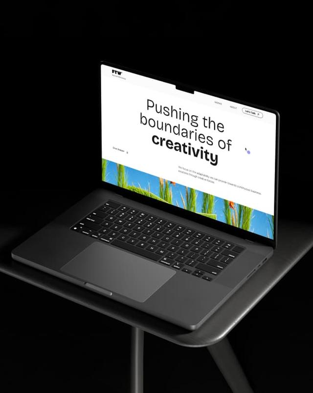
Shaping FTW’s digital presence through a modern and timeless experience.
Services
- Web Development
- UI/UX Design
BACKGROUND
Establishing a digital home designed to clearly represent the agency.
FTW is a creative agency that is part of the Future Creative Network (FCN). Over the years, FTW has collaborated with many brands across various projects, building a wide range of work. However, there was no single digital home that brought all of those works together while clearly communicating FTW’s services.
To address this, FTW partnered with us to build a digital home that represents the agency’s capabilities. The goal was to create a digital presence that makes it easy for audiences to explore the work and understand FTW’s expertise.

CHALLENGE
Creating clarity across touchpoint while keeping the experience intuitive.
FTW’s portfolio is heavily visual, spanning different categories and storytelling styles. The challenge was to showcase a wide range of projects in a way that feels easy to explore, while making the agency’s services clear at a glance. At the same time, the website needed to stay lightweight, fast, and intuitive, providing clarity without overwhelming visitors.

WEB DEVELOPMENT
Building a fast and stable structure that supports visual-first storytelling.
The website was developed with a focus on speed and stability, supported by an SEO-friendly structure and a clean content hierarchy.
Photo and video content were positioned as the main storytelling elements for each project. To keep performance smooth, portfolio videos were embedded via YouTube, allowing rich visual content without adding heavy load to the site. The portfolio was organized into two main sections, Brand Communication and Brand Experience, helping visitors quickly understand the scope of work.
USER INTERFACE DESIGN
Designing a modern and timeless visual interface.
A contemporary design direction was applied to create an interface that feels modern yet timeless. Clean layouts, balanced spacing, and restrained use of visual elements help the work stand out without distraction.
Rather than following short-lived trends, the interface was designed to remain relevant over time, allowing the website to support FTW’s growing portfolio while staying accessible to audiences of different ages and backgrounds.

A STORY OF TYPOGRAPHY
Balancing brand character and readability through type.
For headlines, Bricolage Grotesque was selected due to its similarity to Power Grotesque, FTW’s main brand font. Its distinctive curves add character while maintaining a modern and contemporary feel.
For body copy, Anderson Grotesque was used for its simplicity and high readability. This pairing creates a clear hierarchy and ensures content remains comfortable to read across different devices and screen sizes.


USER EXPERIENCE DESIGN
Creating an experience that feels genuine and effortless.
The experience was designed to present an honest view of FTW’s portfolio. By focusing on real projects and highlighting achievements, the website builds trust and reinforces FTW’s credibility.
At the same time, the experience is kept effortless. Clear structure, easy access, and a straightforward layout allow visitors to explore the content and portfolio without confusion. The result is a smooth, intuitive journey that respects users’ time and keeps the focus on the work.