

AXIS Alifetime
Telco
Client
AXIS
to Explore
Redesigning Alifetime into clearer, more human, and engaging loyalty experience.
- Strategy
- Research
- UI/UX Design
- App Development
Connecting AXIS users to a more engaging loyalty experience.
Alifetime is a coin-based loyalty program on AXISNet where young users can collect coins and unlock exciting rewards. As the feature evolved, the experience needed to guide users across membership status progress and reward discovery more clearly. Together with AXIS, we revamp the loyalty experience to make it more contextual, engaging, and easier to navigate.

Simplifying a fragmented loyalty experience into clearer journeys for progression and rewards.
The previous Alifetime experience combined multiple objectives into a single screen. Explore Membership and Redeem Bonus were placed within the same landing page, while other loyalty touchpoints lacked clear context. We were challenged to redesign the experience into clearer paths that help users understand their status and next actions more easily.
Turning loyalty tiers into a relationship journey.
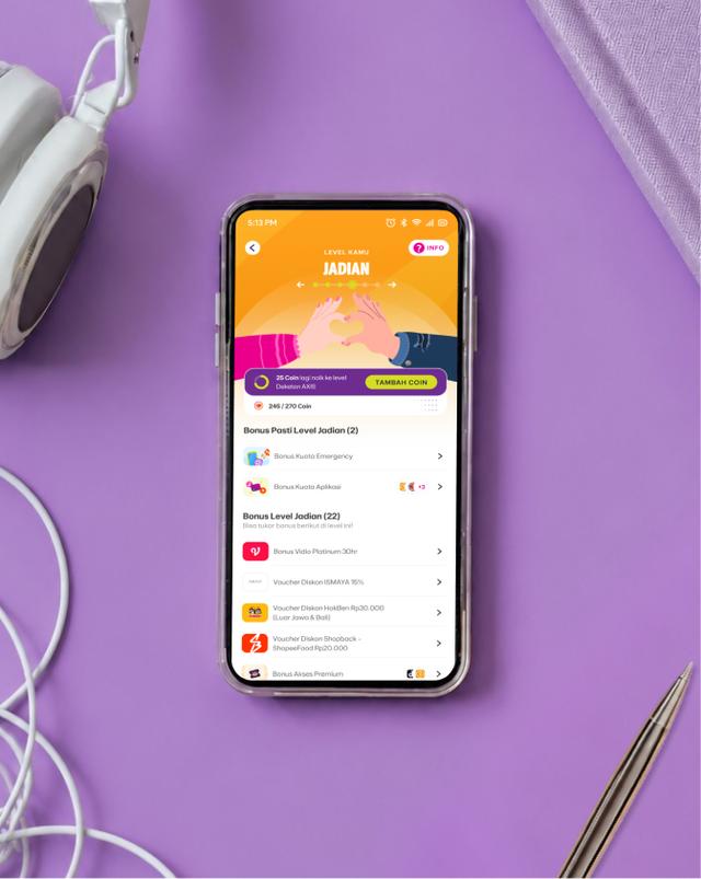
To help users better understand and connect with loyalty experience, we transformed membership tiers into a relationship-inspired journey based on real-life human expressions. Each tier represents a different stage of connection, from Kenalan, Temenan, Deketan, Jadian, Soulmate, to True Love.
We expressed this concept through a visual language of hand gestures, playful illustrations, and subtle animations. Each tier was designed with its own distinct expression, helping users recognize their current level while making the experience feel more human, emotional, and engaging.


Simplifying a fragmented loyalty experience into clearer journeys for progression and rewards.
The previous Alifetime experience combined multiple objectives into a single screen. Explore Membership and Redeem Bonus were placed within the same landing page, while other loyalty touchpoints lacked clear context. We were challenged to redesign the experience into clearer paths that help users understand their status and next actions more easily.

Designing a clearer visual system that helps users understand at a glance.
The UI was designed to make Alifetime easier to scan, understand, and enjoy. Therefore, we represent level status using expressive hand gestures to make each tier more distinct and make the relationship-status progression easier to recognize without relying heavily on text.
The reward experience was also improved with clearer and more contextual thumbnails. Instead of generic icons, rewards are represented with recognizable visuals, helping users quickly understand their value and making the redemption experience feel more tangible.
Making progress more visible and motivating throughout the journey.
To help users stay connected with their loyalty journey, we improved how progress and membership status are communicated throughout the experience. Alifetime now provides clearer contextual signals around progression, current status, and next milestones.
These updates help users better understand where they stand and what they need to achieve next, making the journey more transparent and motivating continued engagement.
